Closed Thread Icon

Topic awaiting preservation: A thread title without the word tes.. aw, shit. (Page 1 of 1) Pages that link to <a href="https://ozoneasylum.com/backlink?for=13443" title="Pages that link to Topic awaiting preservation: A thread title without the word tes.. aw, shit. (Page 1 of 1)" rel="nofollow" >Topic awaiting preservation: A thread title without the word tes.. aw, shit. <span class="small">(Page 1 of 1)</span>\

 
mahjqa
Maniac (V) Mad Scientist

From: The Demented Side of the Fence
Insane since: Aug 2000

posted posted 05-07-2003 16:31

It's not supposed to be an human eye, that's why it's a little wider and has the cat-like pupil.

GrythusDraconis
Paranoid (IV) Inmate

From: The Astral Plane
Insane since: Jul 2002

posted posted 05-07-2003 17:13

I like it... I think the dialation of the pupil when it flashes your name is... distracting however... I love how the pupil changes as the eye closes and opens. That's pretty cool.

Is the pupil quite perpendicular to the bottom of the eye? It seems like it's slightly clockwise of where it should be oriented.

Just my take.. Good job... you have such cool sig's.

GrythusDraconis
"I'm sick of hearing that beauty is only skin-deep. That's deep enough. Who wants an adorable pancreas?" - Unknown

kaboi
Paranoid (IV) Inmate

From: Nairobi, Kenya
Insane since: Mar 2002

posted posted 05-07-2003 18:13

Quite some work Mahjqa! I really dig this sig, very realistic. I like the way the eye closes

quote:
Is the pupil quite perpendicular to the bottom of the eye? It seems like it's slightly clockwise of where it should be oriented.


I also noticed that. Is it by design or maybe something you overlooked.

Gilbert Nolander
Maniac (V) Inmate

From: Washington DC
Insane since: May 2002

posted posted 05-07-2003 18:14

Yea,
I see what your saying GD. To me it looks like the pupil should be rotated a bit more counter-clockwise.

mahjqa
Maniac (V) Mad Scientist

From: The Demented Side of the Fence
Insane since: Aug 2000

posted posted 05-07-2003 19:07

I've overwritten it.. This one's the old one, the newest is in the first post.

Amerasu
Paranoid (IV) Inmate

From:
Insane since: Jun 2002

posted posted 05-07-2003 20:23

It's nice, Mahjqa. Very sleek.

I wish I had the patience to animate sigs like you do.

mahjqa
Maniac (V) Mad Scientist

From: The Demented Side of the Fence
Insane since: Aug 2000

posted posted 05-07-2003 22:22

Added more shinyness to the white of the eye.

Xenon
Bipolar (III) Inmate

From: Inside the Light Bulb
Insane since: Apr 2003

posted posted 05-08-2003 00:30

That is awesome....definately one of the nicest eye sigs I've seen...

GrythusDraconis
Paranoid (IV) Inmate

From: The Astral Plane
Insane since: Jul 2002

posted posted 05-08-2003 00:31

I really like that last one, mahjqa. Very clean. Good work.

GrythusDraconis
"I'm sick of hearing that beauty is only skin-deep. That's deep enough. Who wants an adorable pancreas?" - Unknown

hellfireclanx
Bipolar (III) Inmate

From:
Insane since: Mar 2003

posted posted 05-08-2003 01:35

another awsome sig
good work


[This message has been edited by hellfireclanx (edited 05-08-2003).]

platyjim
Bipolar (III) Inmate

From: Fromsville
Insane since: Feb 2003

posted posted 05-08-2003 02:43

did you use extrude for the iris?

DL-44
Maniac (V) Inmate

From: under the bed
Insane since: Feb 2000

posted posted 05-08-2003 02:51

I have to say - for the first time in a while now - that I don't like it.

I love the work on the iris and the pupil, but the overall appearance and it's functionality as a sig is just not working.

It's just kind of...awkward.

Raptor
Paranoid (IV) Inmate

From: AČ, MI, USA
Insane since: Nov 2001

posted posted 05-08-2003 03:03

platyjim: Looks to me like it's airbrushed (set the blend option to screen) using a lighter color of the iris.

mahjqa
Maniac (V) Mad Scientist

From: The Demented Side of the Fence
Insane since: Aug 2000

posted posted 05-08-2003 08:51

DL-44... Any recommendations on what to do with it? The iris and pupil work, you say, but the rest doesn't. Any suggestions on what to do with it, then?

There's two ways I can take, one is to make it more realistic, which would mean to change the eye shape and with a normal (round) pupil, or I could go all the way alien and make it a weird color (although I like this color a lot) and add veins and stuff. Meh.


[This message has been edited by mahjqa (edited 05-08-2003).]

Gilbert Nolander
Maniac (V) Inmate

From: Washington DC
Insane since: May 2002

posted posted 05-08-2003 15:33

mahjqa - when are you getting a job with Lukas Arts? There animations need some work..

sharma
Bipolar (III) Inmate

From:
Insane since: Dec 2000

posted posted 05-08-2003 17:08

mahjqa, although i like this one, i feel that it is missing something. I think that the issue i'm having with it is that there is clearly a light direction based on the reflection off of the eye ball. However, the area above and below the eye remains completely flat. I think that if you were to add just a hint of shading and roundness above and below the eye it would really look great. Also, because you have the eye on an angle anyway, adding this shading wouldn't make the sig much taller. Maybe that's not the look you want to go for. I think it would look good though.

DL-44
Maniac (V) Inmate

From: under the bed
Insane since: Feb 2000

posted posted 05-08-2003 17:54

Sharma's thoguhs echo some of mine as well.

It just goes directly to flat, which leaves it....akward (I keep coming back to that word...)

I don't think you need to go more human, and I don't think you need to go all out with some weirder them either.

I think making the shape of the opening a little more natural would help (it's just a little too perfectly diagonal and symmetrical), as would some shading of the lids.

mahjqa
Maniac (V) Mad Scientist

From: The Demented Side of the Fence
Insane since: Aug 2000

posted posted 05-08-2003 21:27

A somewhat cheap solution, but... better?

GrythusDraconis
Paranoid (IV) Inmate

From: The Astral Plane
Insane since: Jul 2002

posted posted 05-08-2003 23:27

Yes... better. Much better actually. I like the definition that simple line provides.

Something I was thinking... could you make it have depth before opening? Like making a depression in the shape of the eye, have it open, do it's thing, close and then flatten out again? Make it grow out of the asylum as it were. I think that would be really cool and it would remove the 'flatness' that is being discussed.

"Ozone Asylum - You aren't paranoid when you think the walls have eyes."

That may be a fantastical amount of work but I think it would make a really impressive graphic... not so clean anymore, but neat. Otherwise the newest version is excellent the way it is.

GrythusDraconis
"I'm sick of hearing that beauty is only skin-deep. That's deep enough. Who wants an adorable pancreas?" - Unknown

Taobaybee
Maniac (V) Inmate

From: The Pool Of Life
Insane since: Feb 2003

posted posted 05-09-2003 12:19

"Here's looking at you kid". Great sig again mahjqa. I also liked the idea of your name just showing as a reflection.
Tao

Ruski
Paranoid (IV) Inmate

From:
Insane since: Jul 2002

posted posted 05-09-2003 15:58

I like the last one and I dont think you need anymore of solutions, it looks good enaugh....\


umm Gilbert, I wouldnt call mahjqa an animation master...to me he is a "SIG GOD"
and a very good pixel artist....

now as for being an animator its a little diffrent from what he does...he is still great at understanding the whole point of motion!

but animators are a little diffrent, requeres alot of studies and you have to be real good at drawing and overall if you need 3D...well you also must have a good knowledge of powerfull 3D app...like Maya or softimage

platyjim
Bipolar (III) Inmate

From: Fromsville
Insane since: Feb 2003

posted posted 05-09-2003 21:18

Raptor: Open up your photoshop and make a little green ball and filter>stylize>extrude and set it to 20 and 255. Do that a couple of times. See what i mean?

mahjqa
Maniac (V) Mad Scientist

From: The Demented Side of the Fence
Insane since: Aug 2000

posted posted 05-11-2003 01:53

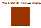
I didn't use extrude, I used polar coordinates. For more information; watch the animation or follow the link.

DarkGarden
Paranoid (IV) Inmate

From: in media rea
Insane since: Jul 2000

posted posted 05-11-2003 04:07

The problem? Depth and tone it seems.

You expect an eye to be (basically) a sphere, no matter what the species. What we have is a nice iris sitting in a poorly shaded ellipse.

I love the animation, but the actually eye needs work. Try darkening down the edges where the sphere would curve toward invisibility from the viewer. Use some oranges and yellows instead of hazy gresy, as they should reflect the colours of the surrounding eyelid a touch. Now, imagine shining a light through a slit on a ball. Where the light fell directly=nice and bright...then the shape of the slit would fall "around" the sphere, and then the light would fall off almost completely at the visible edges of that sphere.

Cast shadows.

So your horizontal center will get the most light, and throw a bevelled shade onto the sphere around the eyelid...but a sphere's still a sphere, start shading it like one

Maybe even include a slight high and lowlight where the eyelid would "bulge" to hold the eye.

Other than that, she's nice...now keep working on it. Abandonment causes issues

mahjqa
Maniac (V) Mad Scientist

From: The Demented Side of the Fence
Insane since: Aug 2000

posted posted 05-11-2003 14:44

Another update...

DarkGarden
Paranoid (IV) Inmate

From: in media rea
Insane since: Jul 2000

posted posted 05-14-2003 01:18

Better colour...touch of texture...more organic edging...

It's coming along.

Now keep easing your tones down...it's still not quite "spherical" it falls off at the edges too quickly.

« BackwardsOnwards »

Show Forum Drop Down Menu