Closed Thread Icon

Preserved Topic: WIP: Don't Give Me That (Page 1 of 1) Pages that link to <a href="https://ozoneasylum.com/backlink?for=21470" title="Pages that link to Preserved Topic: WIP:  Don&amp;#039;t Give Me That (Page 1 of 1)" rel="nofollow" >Preserved Topic: WIP:  Don&#039;t Give Me That <span class="small">(Page 1 of 1)</span>\

 
InSiDeR
Maniac (V) Inmate

From: Oblivion
Insane since: Sep 2001

posted posted 04-21-2004 04:51

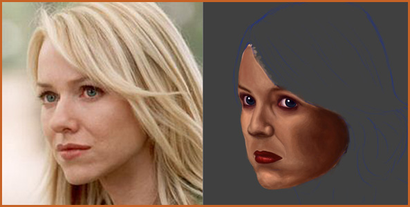
Out of recent events with my girl (ex.....) and her new guy (ass), I felt like painting another Naomi. Yes, for those of you who have seen Mulholland Drive, this is Naomi Watts in her most jealous/hatred driven moments.

WIP of course.


Ref used.

-------------------------------

Did some work with the colors, eyes, and lips.

Ruski
Paranoid (IV) Inmate

From:
Insane since: Jul 2002

posted posted 04-21-2004 05:43

HEY! Thats F*cking good!

I love it man...You have improved a bunch.

the eyes look awesome..

the only problem so far I see, lips are a bit down..rise em up...then again maybe not I am not sure(but they sure as hell look a bit wierd and out of order.)

InSiDeR
Maniac (V) Inmate

From: Oblivion
Insane since: Sep 2001

posted posted 04-21-2004 06:28

I think it's just a lack of shadow under the nose. I'm pretty sure they're positioned right, though. I did use a ref =\\.

(Edited by InSiDeR on 04-20-2004 21:29)

counterfeitbacon
Paranoid (IV) Inmate

From: Vancouver, WA
Insane since: Apr 2002

posted posted 04-21-2004 08:53

The painting is really good, but I have two complaints. The first is that it looks to be based off of line, and the second is that it doesn't look like Naomi Watts. These two are linked:

Here is a picture of Naomi Watts, and your image (beautiful...drool):


There is a big difference, although if told that this was Naomi Watts, I would say: yeah...but, you need to capture her likeness. It also has anatomical problems that (a) detract from the painting and (b) take away from her likeness. Oh yeah, and the skin tones are kinda odd. Try this:

1. Take your original image
2. Desaturate it: this shows you where the lights and darks should go in an image. Sometimes with color images, it's very tricky to recreate it.
3 & 4. Block out forms. I used the cutout tool, but working off the desaturated image works fine. With digital art, it's helpful to use the cutout tool to quickly block out form. Work off this. Define the form of the object, in this case a face, and then build upon that. You can add color later. Even when using oils, you need to build upwards - define form, then go from there, adding in more and more detail. And work over the whole image first. Draw in a quick hairline, etcetera. It will help you later on. I can't do it yet, very well, which is why my drawings suck (aside from not enough skill, which is the overriding factor), but you need to train your eye to see things in a new light: you need to be able to pick out form and line, etcetera.


Hope this helps, and keep up the good work

__________________
War is Peace,
Freedom is Slavery,
Ignorance is Strength.

(Edited by counterfeitbacon on 04-20-2004 23:54)

InSiDeR
Maniac (V) Inmate

From: Oblivion
Insane since: Sep 2001

posted posted 04-21-2004 19:02

CFB, thankyou. But that is not the reference I am using. I can assure you my anatomical assertions are precise, however you may have a point with the shadows.

InSiDeR
Maniac (V) Inmate

From: Oblivion
Insane since: Sep 2001

posted posted 04-21-2004 21:12

Ah, Ruski I think you were right about the lips being too low. I moved up the bottom part of her face a few pixels and painted over it, also did more work with the lips to give her a frustrated look (they still need more developing).

counterfeitbacon
Paranoid (IV) Inmate

From: Vancouver, WA
Insane since: Apr 2002

posted posted 04-21-2004 21:16

Ok, can you post the reference? Just wondering what it actually looks like, because it wasn't recognizable as Naomi Watts, is why.
Since my point, though, is sorta moot (as with what you last said), I tried to take down the large images but it says I can't edit.
Oh well...

__________________
War is Peace,
Freedom is Slavery,
Ignorance is Strength.

InSiDeR
Maniac (V) Inmate

From: Oblivion
Insane since: Sep 2001

posted posted 04-21-2004 21:28

Grr, the reference is a video. My rom doesn't support DVD's so I had to download the last portion of the film and pause it each time I paint. Therefor I cannot show this reference (unless someone can think of a way to take a screenshot of a .avi).

(Edited by InSiDeR on 04-21-2004 12:31)

Ruski
Paranoid (IV) Inmate

From:
Insane since: Jul 2002

posted posted 04-21-2004 21:42
quote:
Ah, Ruski I think you were right about the lips being too low


reason is because I noticed, that you made her nose shorter when started painting...look into sketch again...first image, notice the blue lines...

but, don't worry about it..I think it's the most common mistake if you paint/draw portraits...I used to do it alot...still do.

I also think the lower part of the nose should be more visible...and it has to be a little more thin in the middle and straight...it looks a bit bend...

(Edited by Ruski on 04-21-2004 14:00)

counterfeitbacon
Paranoid (IV) Inmate

From: Vancouver, WA
Insane since: Apr 2002

posted posted 04-21-2004 21:57
quote:
Grr, the reference is a video. My rom doesn't support DVD's so I had to download the last portion of the film and pause it each time I paint. Therefor I cannot show this reference (unless someone can think of a way to take a screenshot of a .avi).


...printscreen?

__________________
War is Peace,
Freedom is Slavery,
Ignorance is Strength.

Alevice
Paranoid (IV) Inmate

From: Mexico
Insane since: Dec 2002

posted posted 04-21-2004 22:20

Virtualdub may help for getting a screenie of it..

__________________________________


Sexy Demoness cel

bodhi23
Paranoid (IV) Inmate

From: Greensboro, NC USA
Insane since: Jun 2002

posted posted 04-21-2004 22:58

InSiDeR, you are really getting good. I'd have to see the reference to be really certain of the missed details. But that last one is really starting to look human.

Keep it up!

InSiDeR
Maniac (V) Inmate

From: Oblivion
Insane since: Sep 2001

posted posted 04-23-2004 04:24

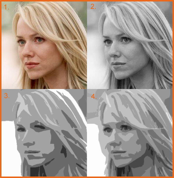
Fooled around with the hair to get it off the ground.

InSiDeR
Maniac (V) Inmate

From: Oblivion
Insane since: Sep 2001

posted posted 04-27-2004 03:30

Update.


_____________________
Prying open my third eye.

counterfeitbacon
Paranoid (IV) Inmate

From: Vancouver, WA
Insane since: Apr 2002

posted posted 04-27-2004 04:36

It's looking a lot better, but I'm serious, it still doesn't look quite right. Like I said before, what I mean is that you might have the nose just right, or the eyes, or the crease from the nose to the edge of the lip, but there are some general anatomical differences between your portrait of, and the real, Naomi Watts. I believe that most of it has to do with the actualy shape of the face, not in the minor details, which look great.

But anyways, it's still very good

__________________
War is Peace,
Freedom is Slavery,
Ignorance is Strength.

(Edited by counterfeitbacon on 04-26-2004 20:35)

Amerasu
Paranoid (IV) Inmate

From: Canada
Insane since: Jun 2002

posted posted 04-27-2004 19:31

Yep, looks great so far, nice work!

Agree with CB though, it doesn't quite look like Naomi Watts. Jaw line/chin and facial width maybe? And lips.

Still looks good though. Best painting I've seen from you, Insider (that's been posted here at least).

Amerasu |

InSiDeR
Maniac (V) Inmate

From: Oblivion
Insane since: Sep 2001

posted posted 05-10-2004 04:55

HAPPY HAPPY JOY JOY

InSiDeR
Maniac (V) Inmate

From: Oblivion
Insane since: Sep 2001

posted posted 05-25-2004 08:29


*bump*

(Edited by InSiDeR on 05-25-2004 08:29)

InSiDeR
Maniac (V) Inmate

From: Oblivion
Insane since: Sep 2001

posted posted 05-27-2004 02:02


Another bump, perhaps.

counterfeitbacon
Paranoid (IV) Inmate

From: Vancouver, WA
Insane since: Apr 2002

posted posted 05-27-2004 02:19

's good

It's looking a lot more polished (not to mention like Naomi Watts).

I think you could work on the hair more though.

Anyways, better than anything I could pull out. Good job

__________________
War is Peace,
Freedom is Slavery,
Ignorance is Strength.

InSiDeR
Maniac (V) Inmate

From: Oblivion
Insane since: Sep 2001

posted posted 05-27-2004 03:23

The hair shall be worked with, I can assure you.

counterfeitbacon
Paranoid (IV) Inmate

From: Vancouver, WA
Insane since: Apr 2002

posted posted 05-27-2004 03:36

Oh yeah, and the lips seem to start a bit abruptly. Unless she has precision lipstick on, or something.

__________________
War is Peace,
Freedom is Slavery,
Ignorance is Strength.

InSiDeR
Maniac (V) Inmate

From: Oblivion
Insane since: Sep 2001

posted posted 05-27-2004 04:05

I'm not sure what you mean by that... Can you please explain? Because I, too, see a problem with the lips and I can't quite pinpoint it out.

counterfeitbacon
Paranoid (IV) Inmate

From: Vancouver, WA
Insane since: Apr 2002

posted posted 05-27-2004 08:07

I mean that there is a very abrupt line between where the lips start and stop. Lips don't have an abrupt line, but "fade out," in a way.

It seems like traditionally, at least, the eyes are supposed to be the focal point of a portrait, as they hold the most emotional weight.
The lips are so bright red, when compared to the rest of the painting, that the draw almost all your attention.

__________________
War is Peace,
Freedom is Slavery,
Ignorance is Strength.

InSiDeR
Maniac (V) Inmate

From: Oblivion
Insane since: Sep 2001

posted posted 05-27-2004 08:14

Hmm. That's strange because when I look at it the first place my eyes go are the eyes.

(Edited by InSiDeR on 05-27-2004 11:15)

« BackwardsOnwards »

Show Forum Drop Down Menu