Preserved Topic: First attempt at realistic shading (Page 1 of 1) |
|
|---|---|
|
Lunatic (VI) Mad Scientist From: Massachusetts, USA |
 posted 02-13-2002 20:49
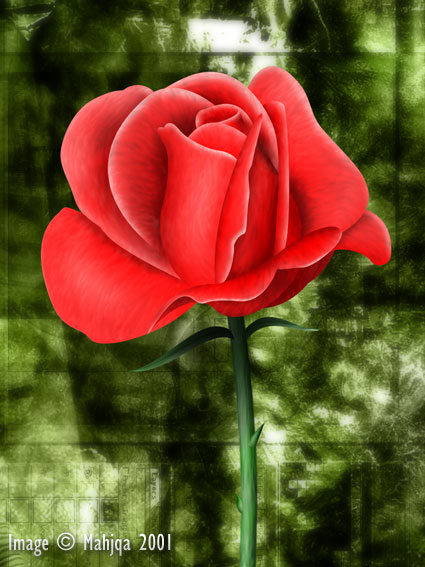
Opinions? Suggestions for future reference? |
|
Paranoid (IV) Inmate From: The Soft Cell |
posted 02-13-2002 21:07
How about adding some water droplets and maybe even some fine veins? |
|
Maniac (V) Mad Scientist From: |
posted 02-13-2002 21:10
A more neutral background. |
|
Lunatic (VI) Mad Scientist From: the Psychiatric Ward |
posted 02-13-2002 21:24
That is a really nice shape... Excellent shading! If you want realistic shading tho... you need to add some texture. It is way to clean and way to smooth now... |
|
Maniac (V) Mad Scientist From: The Demented Side of the Fence |
posted 02-13-2002 22:37
Get some pictures from google, and see what they have. Veins are good. more detail. It doesn't have to be perfect (although this is presumeably for valentine's day, so you don't want a beat-up rose) but in general what adds realism are the imperfections. |
|
Lunatic (VI) Mad Scientist From: the Psychiatric Ward |
posted 02-13-2002 22:44
grrrrr...... Im gonna hava make one now... sheesh... I forgot all *about* valentine's day. |
|
Lunatic (VI) Mad Scientist From: Massachusetts, USA |
posted 02-13-2002 22:48
Hmm, OK, so obviously it needs texture. What's a good way to add texture? I've tried a few times, and haven't been able to add realistic veins to leaves or whatnot. The details are always the hard part =) |
|
Maniac (V) Mad Scientist From: The Demented Side of the Fence |
posted 02-13-2002 22:59
Slime: add a layer, group it with the layer you have your petals on. You prpoably have to merge them for that, so be sure to save a backup. Fill the layer with black, then [filter>noise>add noise] in monochromatic, and at 400%. set the layer to [hard light], and 10% visibility. Grab the smudge tool (press R) and start smudging in the direction you want the veins in. |
|
Maniac (V) Mad Scientist From: buttcrack of the midwest |
posted 02-14-2002 00:02
Good one, Slime. This is yur first ? Wow. Pretty good job for a first shading attempt. |
|
Lunatic (VI) Mad Scientist From: the Psychiatric Ward |
posted 02-14-2002 04:12
Hey, Thanks for the tips guys! hhaha... I was just lookin at that Rose of mahjqa's when I went to review his webpage... I was thinkin, wow... I dont think I would have the patience to do that... heh... |
|
Maniac (V) Inmate From: under the bed |
posted 02-14-2002 18:45
Wow - very impressive Slime |
|
Lunatic (VI) Mad Scientist From: Massachusetts, USA |
posted 02-14-2002 19:05
Each petal is outlined with a path... some of the edges I drew a selection around and then just colored in the selection because it was faster than making a new path. I kinda surprised myself with how the shape came out so almost-realistically. =) First I did the second layer of petals in, then, noticing it would be too small, I did the outer layer. Then I did the stem, and then the inner layers of petals from the outside inwards. On the final inside petal, I just sort of scribbled with the dodge and burn tools, and it came out pretty good. Each petal is on its own layer. |
|
Lunatic (VI) Mad Scientist From: the Psychiatric Ward |
posted 02-14-2002 19:17
wow... Much respect Slime! Much!!! I was wondering how you did that. When ever I shade things I usually start from a foto... In this case, a foto of a rose... I blocked out the rose shape in gray and then went to town with lights and darks, shading... checkin the foto to see how the petals curved... weehoo... that was a good long time to start at my monitor.... *yawn* I got a bunch of skool now tho... yeck... |
|
Maniac (V) Inmate From: Brisbane, Australia |
posted 02-15-2002 09:23
Coolness. There's some nice stuff being tossed around in here. Izzay, I really like the roze on the right hand side. I'm also loving the use of colurs and tonal variations. |
- Copyright ©1994-2026 by Doctor Thaddeus Ozone, all rights reserved. -
- Grail copyright ©2000-2026 by Tyberius Prime, all rights reserved. -
![]()
![]()
![]()
Debug: This page needed 0.00038314 seconds to process.